import geopandas
import geodatasets

import pandas as pd
import numpy as np

from plotnine import *

cheese = pd.read_csv(
    "https://raw.githubusercontent.com/rfordatascience/tidytuesday/master/data/2024/2024-06-04/cheeses.csv"
)
country_lat_long = pd.read_csv(
    "./world_country_and_usa_states_latitude_and_longitude_values.csv"
)[["latitude", "longitude", "country"]]Plotnine plot contest
python
A very cheesy map made with
plotnine
Plotnine is running a plot contest! And it is not too late to enter, submissions close July 12!
For my submission1, I’ll start with reading in cheese data from TidyTuesday, as well as a csv of longitudes and latitudes of different countries.
Next, some data manipulation to set us up with tidy data to plot.
cheese['country']=cheese['country'].str.split(pat=', ')
cheese['milk']= cheese['milk'].str.split(pat=', ')
cheese = cheese.explode('country').explode('milk')
mode_milk = cheese.groupby('country')['milk'].agg(pd.Series.mode).reset_index()
country_value = cheese["country"].str.split(pat=', ').explode().str.strip().value_counts().reset_index()
cheese_plot = country_value.merge(country_lat_long, how = "left", on="country")
cheese_plot = cheese_plot.merge(mode_milk, how = "left", on = "country").explode('milk')
top_countries = cheese_plot.sort_values("count", ascending=False).replace(["United Kingdom"], ["U.K."]).head(5)We also will use geopandas in order to generate the map itself.
geodatasets.fetch("naturalearth land")
world_lowres = geopandas.read_file(
    "https://github.com/geopandas/geopandas/raw/v0.9.0/geopandas/datasets/naturalearth_lowres/naturalearth_lowres.shp"
)
world = geopandas.read_file(geodatasets.get_path("naturalearth land"))
Finally, let’s use plotnine to put it all together! The main pieces in play are four geoms_ and then some extra layers to make the plot more readable. A geom_map to generate the map, geom_point to place each circle depicting number and type of cheeses, and two geom_text elements for the country name and number of cheeses. The scale_size edits the size of the points in geom_point and scale_colour_brewer edits the colors of these points. Finally, the theme is a combination of theme_void and custom theme and guides elements.
(
    ggplot()
    + geom_map(world_lowres, color="#474c53", fill="#d0d0d0", stroke="1")
    + geom_point(
        data=cheese_plot,
        mapping=aes(x="longitude", y="latitude", size="count", color="milk"),
        alpha=0.8,
    )
    + geom_text(
        top_countries,
        aes(x="longitude", y="latitude", label="country"),
        fontweight="bold",
        size=16,
    )
    + geom_text(
        top_countries,
        aes(x="longitude", y="latitude", label="count"),
        nudge_y=-4,
        size=16,
    )
    + labs(
        title="Say Cheese: A World Tour",
        subtitle="This map shows the number of cheese types per country and the most common milk used. This is nacho average cheese map!",
        caption="Data from cheese.com via the TidyTuesday project",
        color="Most common milk type used",
    )
    + theme_void()
    + scale_size(range=(3, 60), guide=None)
    + scale_colour_brewer(type="qual", palette="Accent")
    + theme(
        figure_size=(20, 12),
        legend_text_legend=element_text(size=14),
        legend_direction="vertical",
        legend_title=element_text(size=16),
        legend_position=(0.15, 0.35),
        plot_title=element_text(size=36, family="fantasy"),
        plot_subtitle=element_text(size=18),
        plot_caption=element_text(size=16),
    )
    + guides(colour=guide_legend(override_aes={"size": 8, "alpha": 1}))
)
/Users/isabelzimmerman/.pyenv/versions/3.11.4/envs/docker/lib/python3.11/site-packages/plotnine/layer.py:364: PlotnineWarning: geom_point : Removed 11 rows containing missing values.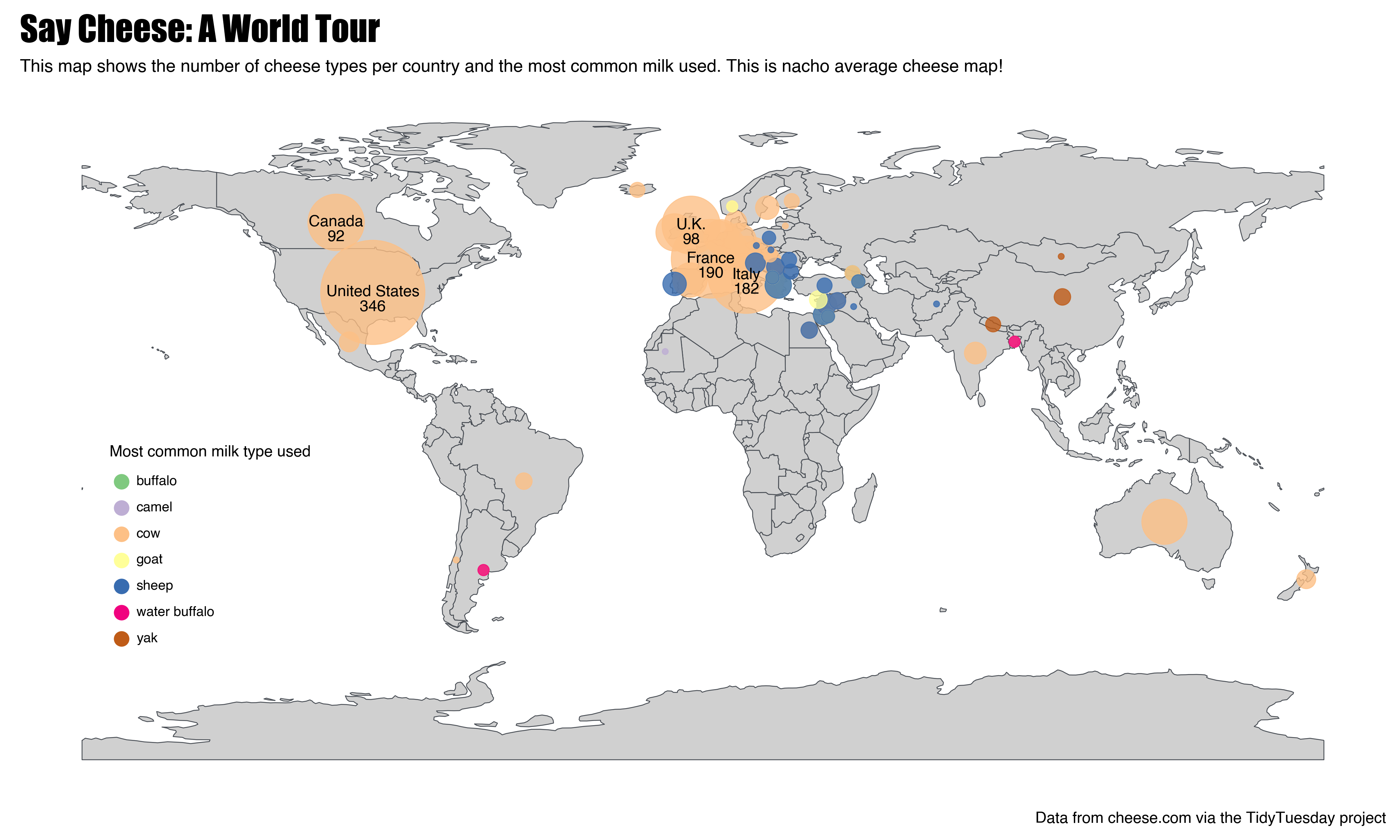
If you’re interested in entering the plot contest, but aren’t sure what data to use, here are a few options that look like a lot of fun:
Hope to see some of your plots!
cheers, isabel
Footnotes
Truthfully, I made this plot because I’m a data nerd with a weird idea of fun. Since I’m an employee of the company Posit (who is sponsoring this contest), I cannot actually enter. But you can! Prizes include fun swag, subscriptions to services to host your portfolio, and the priceless bragging rights of being a open source plotting champion 🏆↩︎